


27. 03. 2025
Development, Front-end, UI

12. 04. 2025
Marco Berlanda
Development, Front-end, UI, UX
Please STOP Designing for Failure: How Optimism Can Transform Your UX
At the beginning of March 2025, my colleague Oscar and I attended the VueJS Amsterdam 2025 conference, and among the hundreds of very cool new concepts and ideas we had a chance to discover, one particular talk stood out for me: for the first time it felt like a utility library was actually including tools that could improve the UX of the product you would use it in. That’s unheard of!

The specific talk I’m referring to was by Eduardo San Martin Morote, and was named “Pinia Colada: A Cocktail of Smooth Data Fetching for Better UX“
Okay okay, wait a second: a data fetching utility that improves UX? One could almost think that the title itself is the actual “optimistic” part of the presentation (and how could you blame him).
So let’s take a step back and talk about a very well established albeit less known UX pattern that was streamlined quite extensively by social networks: the optimistic feedback pattern.
What If Your Product Trusted the User a Little More?
What if your interface responded to user actions instantly? And I don’t mean after displaying a loading spinner, but right away, with confidence?
That’s the magic of optimistic UX. It’s not just a clever UI trick, it’s a product philosophy that says:
“Hey, let’s assume things will go right, and deal with it gracefully if they don’t.”
Big players like Facebook, Instagram, and Gmail have used this mindset to create seamless, delightful experiences. And the good news? You can should use it too.
What Is Optimistic UX?
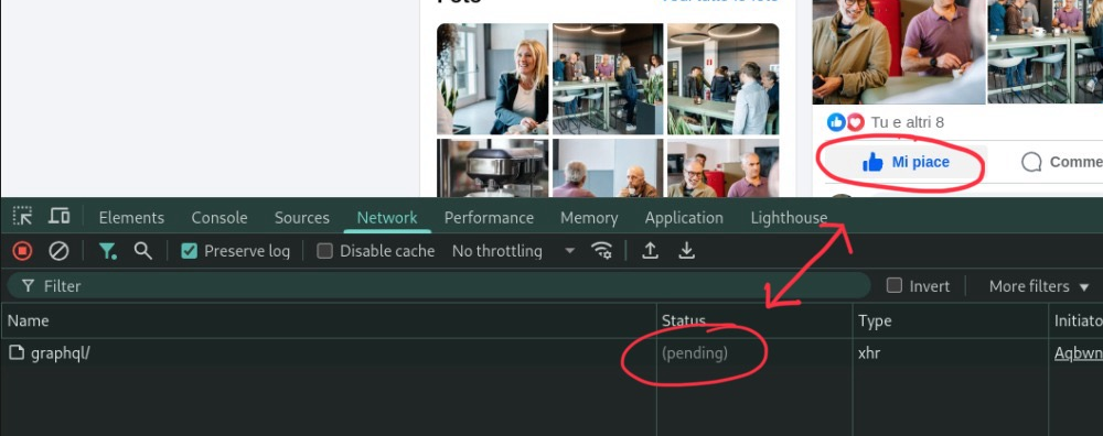
At its core, optimistic UX (or optimistic UI) is about assuming success. When a user performs an action like clicking “Like” or submitting a comment, the interface updates immediately, before the backend confirms it.
The alternative? Waiting. And nobody likes waiting. Do you?
It Should Be the Norm!
You might be wondering: “Isn’t it risky to assume everything will go right?”
But here’s the reality: when something goes wrong on the web, the user is often stuck anyway. A failed request or timeout usually means they’ll need to:
- Refresh the page
- Try the action again
- Or even restart the session altogether
In other words, their experience is already disrupted. So why delay feedback just in case that happens? You’re not preventing frustration, you’re often just shifting it!
And if your product is designed with reliability in mind (what are you, a vibe coder?) then errors are rare by design. If your app is expected to work 99.99% of the time, adding defensive UI patterns “just in case” introduces more harm than good!
Trust your process
Choosing a pessimistic flow in a high-reliability system is like saying, “We’re not sure this will work.”
But you are sure. That’s why you’ve:
- Built fault-tolerant APIs
- Written unit and integration tests
- Deployed monitoring and alerts
- Designed for uptime and performance
Not trusting your own system is, ironically, a step backward in product confidence!
You want to play at the grown-ups table? It’s time to step up.
Protecting User Focus: A Principle of Interaction Design
Interaction Design teaches us that every distraction counts. When users are “in the zone,” they want nothing standing in the way between intent and result.
Loading indicators, confirmation modals, and spinners (yes, even tiny ones) pull them out of flow.
“Don’t make the user wait for something that will almost always succeed. Don’t block their focus to prepare them for failure.”
But please, don’t just take my word for it: let’s make it more tangible.
How Delay Impacts User Flow
Wait Time | User Perception | Impact on Focus |
|---|---|---|
| 0–100 ms | Instantaneous | No disruption |
| 100–300 ms | Noticeable but acceptable | Minimal focus loss |
| 300 ms – 1 sec | Noticeable delay | User begins to lose momentum |
| 1–5 sec | Feels sluggish | Flow is broken |
| 5–10 sec | Feels like a system problem | User distracted or frustrated |
| 10+ sec | Abandonment risk | User likely to exit or reload |
So if waiting breaks flow, and optimism preserves it, the choice becomes clear, don’t you think?
Why compromise the experience of 99.999% of users just to guard against the 0.001% edge case?
Okay, But How Does Pinia Colada Fit in All This?
Pinia Colada is a modern state management library for Vue.js 3. It helps developers implement optimistic UX by introducing a subtle delay before triggering loading states. That means if a network call resolves quickly (as most do) the user never sees a spinner or loader.
Only when a request starts taking too long, or fails outright, does it surface visual feedback. It’s a simple yet powerful way to prioritize smooth flow over defensive UI, reinforcing the idea that success is the default, not the exception.
Conclusion: Optimism Is a UX Principle, Not Just a Pattern
Optimistic UX isn’t reckless, it’s intentional. It reflects a belief in your product, your process, and most importantly, your users.
- It says: “We trust this will work.”
- It says: “We’ll keep you in the zone.”
- It says: “We’re confident in what we built.”
So instead of adding friction to protect against rare failures, you should design for the best case (and recover gracefully only when needed)
That’s not naive. That’s great UX.
These Solutions are Engineered by Humans
Did you find this article interesting? Does it match your skill set? Programming is at the heart of how we develop customized solutions. In fact, we’re currently hiring for roles just like this and others here at Würth Phoenix.
Marco Berlanda
UX Front-end engineer by day, UX wizard by night, and an Interaction design ninja all the time. Always on the hunt for those ‘wow, didn’t see that coming!’ solutions to problems.
Author
Latest posts by Marco Berlanda
29. 10. 2024
Front-end, Real User Experience, UI, UX
The Power of Micro-Interactions: Enhancing UX in Front-end Development
21. 10. 2024
Real User Experience, UX
How Good UX Boosts Business and Cuts Costs