The example code in this article is available on GitHub.
From a brand identity perspective, it’s essential that your company’s theme is applied to all parts of your products.
After my previous blog post where we saw how you can create a Cockpit module with Vue.js, it’s time to see how we can customize the Cockpit login page.
Where should I put my customizations?
The documentation available on GitHub isn’t much, but it’s a good start, and reading it we find out how all the files for customization have to be put in $prefix/share/cockpit/branding/$ID-$VARIANT_ID where $prefix is usually /usr and the $ID and $VARIANT_ID variables are those listed in /etc/os-release.
Change the logo
OK, let’s start with the easiest part and the one that immediately adds a lot of value to your product: let’s change the logo.
Simply place the logo in the aforementioned folder, give it the specific name logo.png, and you are done.
While we’re on the topic, let’s also change the favicon by adding the two files favicon.ico and apple-touch-icon.png.
Change the background image
Another very quick task is to change the background: place a JPG image with the name bg-plain.jpg in the usual folder.
Change the style
Now the time has come for the real work: changing the style via CSS.

OK OK, I know what you’re thinking, I promise this part will be easy, too.
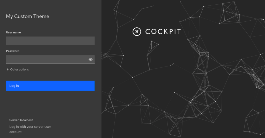
Our goal for this example is to move the login to the side and restyle the form elements to be compliant with the Carbon Design System.
All the CSS that we’re going to write should be put in the file branding.css.
First of all, let’s define the background of the whole page, and since I love dark themes let’s use a nice gray-90:
body.login-pf {
  background-color: #262626;
}
Now let’s move the login field to the left and give it a gray-80 color to have some contrast with the background:
.login-pf .container {
    position: absolute;
    top: 0;
    bottom: 0;
    width: 25%;
    min-width: 480px;
    background: #393939;
    color: #f4f4f4;
    padding: 64px 32px 32px;
}

.login-pf .details {
    position: absolute;
    bottom: 0;
    left: 0;
    width: 25%;
    color: #c6c6c6;
    background-color: #393939;
}
Next let’s change the login button and make it the same as the primary button of Carbon:
.login-button {
    border-radius: 0;
    height: 48px;
    padding: 11px 63px 11px 15px;
    background-color: #0f62fe !important;
}

.login-button:hover {
    background-color: #0353e9 !important;
}

.login-button:active {
    background-color: #002d9c !important;
}

.login-button:focus {
    box-shadow: inset 0 0 0 2px #fff;
}

#login-button-text {
    width: 100%;
    text-align: left;
}
It’s starting to look good, isn’t it?
As a final touch we could change the style of the text inputs, but since it’s a bit more code I’ll just refer you directly to the example I posted on GitHub.
This is the final result:

Conclusion
Now that you’ve understood what the workflow is for customizing the Cockpit login page, all you have to do is clone the example project and create your own fantastic custom page.
These Solutions are Engineered by Humans
Did you find this article interesting? Does it match your skill set? Programming is at the heart of how we develop customized solutions. In fact, we’re currently hiring for roles just like this and others here at Würth Phoenix.


