Making Your Own Video (Tutorials), Part 11: Animation Redux
After my last post on the advantages and disadvantages of the animation style of video, I hope you did your homework! I certainly did, and you can see the results of my first animated video that conveys some basic information on the need for cybersecurity both in English and in Italian.
Probably like you, I knew a bit about animation techniques, but just the high level basics. I had never actually put together anything more than a basic proof of concept. But the need to learn and innovate never stops, or else you risk getting left behind. So when a great example of a simple but effective technical animation came along, at the same time that I had an opportunity to make a new video in that style, the time seemed right to dive in and really learn how to make one.
The animation I came across was Elasticsearch’s introductory product release video for their new version 8 release this summer. It’s exactly 2 minutes long, with music but no spoken audio, so all the important content has to be conveyed in just text and graphics. And yet they do a great job. There was clearly a lot of planning not just on their message, but also how to reinforce that message through the graphics, both animated and static.
Studying is Learning. Doing is Learning.
So let’s ask ourselves how we might be able to create an animation like that. Should we take an existing model as a template, or start on our own from scratch?
It’s true you can learn a lot by taking classes or watching/reading tutorials. But you can also learn a lot just by very carefully and patiently inspecting a great example. My strategy (which I do recommend) is to start off by trying to copy as closely as you can a great example. Not only will you learn while doing, you’ll also have a chance to compare your work to the original, which can be instructive all on its own.
So let’s deconstruct a bit of that video at both a high level and a detailed level, and then see how closely we can reproduce it, summarizing what we’ve learned at the end.
High-Level Analysis
What can we tell just by watching (or looking at some stills of) the whole animation quickly?

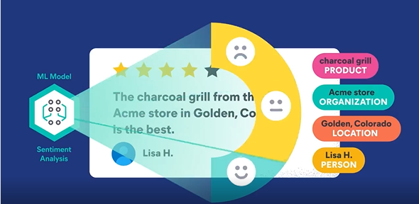
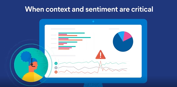
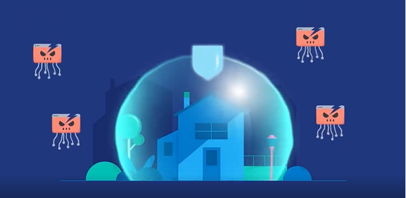
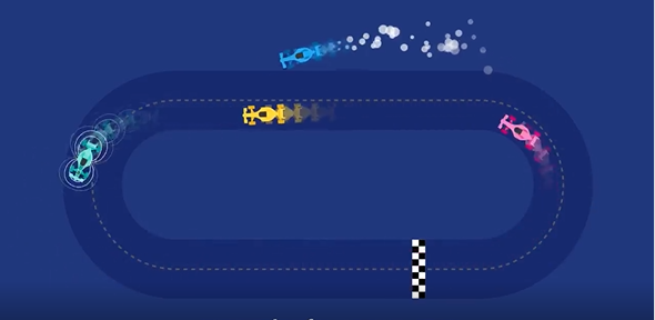
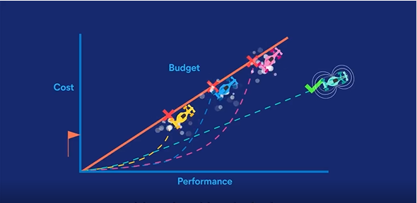
First, the entire video has a unified color palette. The background is always dark blue, the text on colored backgrounds is white, and you see a range of other blue colors and greenish blue colors. White is also often used as a secondary background for text and infographics, usually in the shape of a computer screen. The remaining colors are several dark pastels used as highlight colors to either attract attention or to demonstrate continuity of theme.
Next, the graphics themselves aren’t very complicated. Everything shown above can be drawn in PowerPoint, even if animating all the smaller elements would take a lot of time to set up manually. But what comes across to me is, if I simplified the most complex graphic elements to save time, I would still end up with a pretty good animation.
Third, although you can’t tell from the stills above, there is a constant “wiggling” or “pulsing” of the less thematically important elements that gives a sense of continuous motion. Animation that occurs over longer distances or periods of time is reserved for the more thematically important elements.
Finally, the most difficult animations are dynamically transforming the shape of a graphic into a different shape, and having multiple animations simultaneously affecting the same object, such as the in the 5th still where each car is moving, rotating, and has a motion effect behind it.
So given that, let’s try to copy a few seconds of this animation. We don’t have to be perfectly faithful to the original, so we can ignore the most complex parts, which will save us lots of time while still letting us learn how good animation is done. Once we’ve finished, we can extrapolate how long it would take us to reproduce the entire animation.
Low-Level Analysis
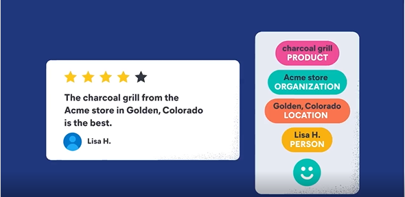
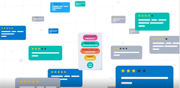
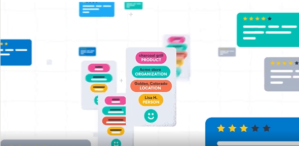
I’ve chosen a few seconds from the middle of the animation (0’22 to 0’27) because it has a wide variety of animation elements that individually aren’t that difficult. For instance, all the main graphics are either rounded rectangles, circles, or text. Related objects are grouped into containers, and similar objects have the same type of container and the same color scheme.
The thematic idea here is that a large number of product recommendations/reviews arrive, and then simple characteristics like the name/ID of the product, where it was bought, who bought it, etc. can be automatically retrieved via NLP methods within Elasticsearch. These can then be correlated with other records already in the database, allowing a product manager to easily look at all the (anonymized) feedback for a given product and then funnel that feedback for instance to the product design team who can then take that feedback into account when updating the product for the next release, or providing information to a sales team about where to allocate new inventory (here e.g., in Colorado).
These few seconds of animation are organized as (1) automatic NLP extraction on the left, (2) placing the newly created record in the database with every other product record in the middle, and (3) finding the most similar/related records on the right, such as reviews of a single product that mention a particular characteristic.
Besides the unified color scheme that I already discussed earlier, there are also repeated elements with the same colors. For instance, the 5 yellow stars are familiar to anyone who shops online, and the database fields have common colors throughout. The animation itself involves moving these containers and the background around the screen, zooming containers in and out, and combinations of the two. The hardest part of this particular animation is the sheer number of objects that must be animated (including coordinated movement) in the middle and right. If you already know some basics of animation like in PowerPoint or ActivePresenter, you can probably recreate the graphics animation on the left in under 15 minutes.
And because the objects in the middle and right stills are basically copies of 3 variations, you could recreate those parts in a draft form in under an hour, with extra time needed to refine and smooth out the coordinated movement. The hardest part then is in the right still where some of the horizontal containers (product reviews) are transformed into vertical containers (database records). Once you master that animation technique, you could probably recreate the entire sequence in a single day.
So suppose it takes us a day (as novices) to do five seconds of animation. Then since two minutes = 120 seconds, we could do the whole thing in a month of 5-day workweeks. Once you’ve become an expert, you could probably get that down to 1-2 weeks. If the animation contains a large number of repeated elements throughout, always uses the same colors, etc., then even more time can be saved.
Limitations of the ‘Copying the Original’ Technique
Copying an existing animation allows us to bypass the very hard work of content planning, animation planning, layout, color selection, etc. We can focus just on the technical elements and skills we’ll need to reproduce it. Think of it in terms of when you visit a museum or a famous city and you see people drawing the artworks or architecture they see with just pencil and paper. While we’re learning we want to be that person, we don’t want to go back in time and and change what’s already there.
But when it comes time to create our own animation from scratch, the nuts and bolts of creating an animation isn’t all there is. We’ll want to create new artworks or architecture that people haven’t seen before. Planning out something new will take longer than executing the animation itself, unless you’re lucky and have one of those brilliant flashes of invention. But don’t worry, just as with practice you can become a better animator, practice will also help you become more focused when creating and planning your future animations.


